Life expectancy increased in all countries of the world
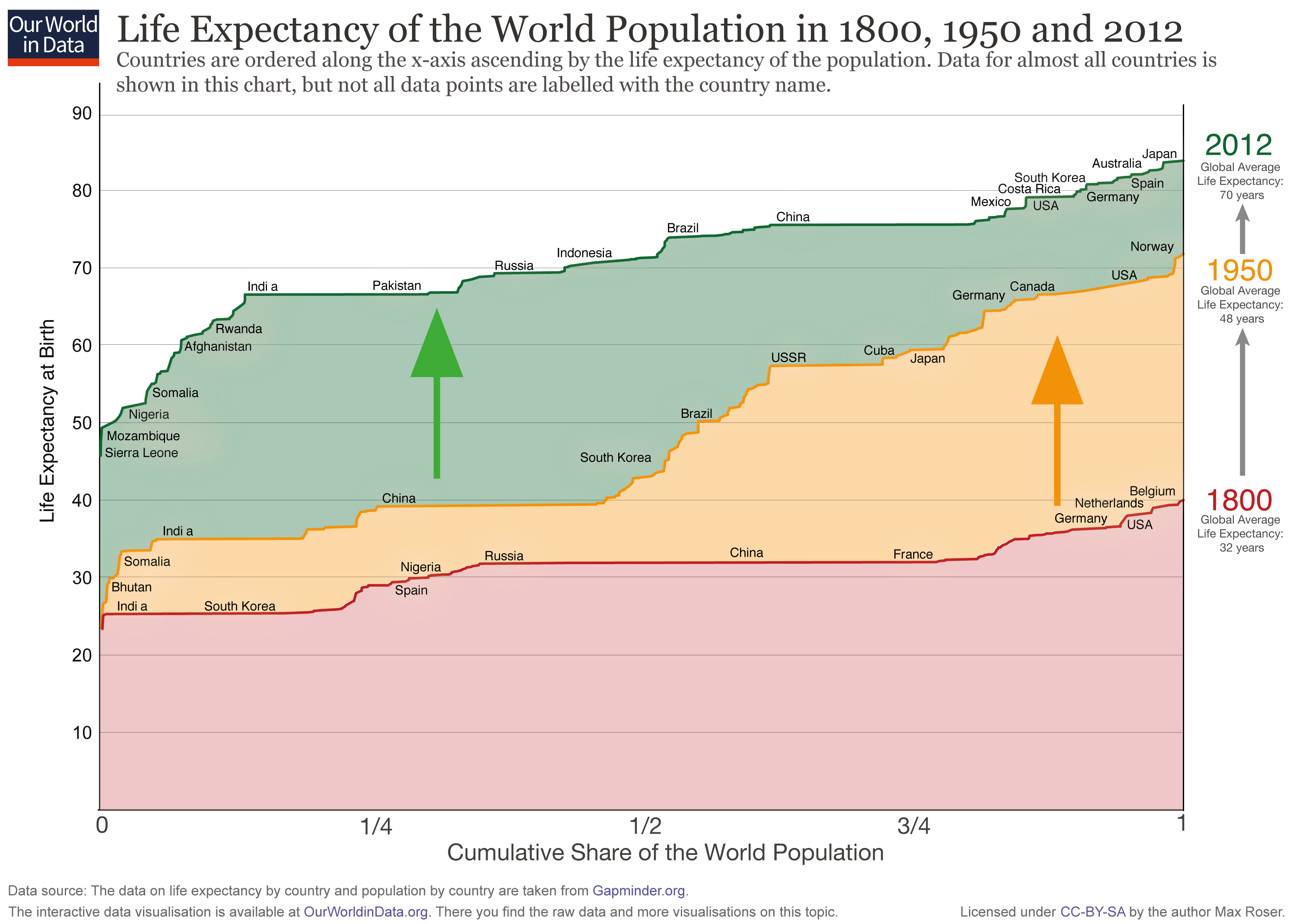
There is a lot of information in the following – rather unusual – chart. On the x-axis you find the cumulative share of the world population. And all the countries of the world are ordered along the x-axis ascending by the life expectancy of the population. On the y-axis you see the life expectancy of each country.

For 1800 (red line) you see that the countries on the left – India and also South Korea – have a life expectancy around 25. On the very right you see that in 1800 no country had a life expectancy above 40 (Belgium had the highest life expectancy with just 40 years).
In 1950 the life expectancy of all countries was higher than in 1800 and the richer countries in Europe and North America had life expectancies over 60 years – over the course of modernization and industrialization the health of the population improved dramatically. But half of the world’s population – look at India and China – made only little progress. Therefore the world in 1950 was highly unequal in living standards – clearly devided between developed countries and developing countries.
This division is ending: Look at the change between 1950 and 2012! Now it is the former developing countries – the countries that were worst off in 1950 – that achieved the fastest progress. While some countries (mostly in Africa) are lacking behind. But many of the former developing countries have caught up and we achieved a dramatic reduction of global health inequality.
The world developed from equally poor health in 1800 to great inequality in 1950 and back to more equality today – but equality on a much higher level.
Cite this work
Our articles and data visualizations rely on work from many different people and organizations. When citing this article, please also cite the underlying data sources. This article can be cited as:
Max Roser (2015) - “Life expectancy increased in all countries of the world” Published online at OurWorldInData.org. Retrieved from: 'https://ourworldindata.org/life-expectancy-increased-in-all-countries-of-the-world' [Online Resource]BibTeX citation
@article{owid-life-expectancy-increased-in-all-countries-of-the-world,
    author = {Max Roser},
    title = {Life expectancy increased in all countries of the world},
    journal = {Our World in Data},
    year = {2015},
    note = {https://ourworldindata.org/life-expectancy-increased-in-all-countries-of-the-world}
}
Reuse this work freely
All visualizations, data, and code produced by Our World in Data are completely open access under the Creative Commons BY license. You have the permission to use, distribute, and reproduce these in any medium, provided the source and authors are credited.
The data produced by third parties and made available by Our World in Data is subject to the license terms from the original third-party authors. We will always indicate the original source of the data in our documentation, so you should always check the license of any such third-party data before use and redistribution.
All of our charts can be embedded in any site.

